Cvent.com — a senior UX review against Nielsen's 10 usability heuristics
An expert-review audit of Cvent's public marketing site and venue-sourcing product (cvent.com and cvent.com/venues), scored against all ten of Jakob Nielsen's heuristics, with severity ratings and prioritized recommendations.
Screens reviewed
This audit is grounded in two primary surfaces: the corporate homepage, which sells the platform to event planners and marketers, and the venue-sourcing tool, which is the site's most transactional, task-driven surface.
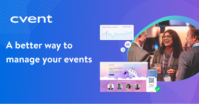
- 1Persistent utility bar: Request Demo · Find Event Venues · Log In
- 2Mega-menu under "Products," organized by Before / During / After your event
- 3Dual CTA hero: "Explore the platform" (low commitment) vs. "Request a demo" (high commitment)
- 4Social proof band: 8M+ events, 350M+ registrations, 1K+ G2 5-star ratings
- 5Long-scroll lifecycle section: Planning → Promotion → Day of Event → Post Event
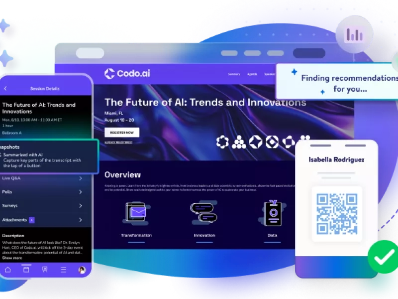
- 1Product screenshot used as hero imagery instead of stock photography — sets real expectations
- 2QR badge and mobile session list shown together, implying check-in and content are unified
- 3No caption or callouts on the image itself — a first-time visitor has to infer what they're looking at
Overall, a mature B2B site with a navigation-density problem
Cvent.com is a well-produced enterprise SaaS site: strong social proof, real product screenshots, and a genuinely useful "before / during / after" mental model for the event lifecycle. The issues found are concentrated in information architecture density (heuristics 4, 6, 8) and lead-capture friction (heuristics 3, 5, 7) — both common at this company size, and both fixable without a redesign.
Heuristics 1–5
- The utility navigation (Request Demo / Find Venues / Log In) stays visible and unchanged across pages, so a user always knows where the "exit to action" points are.
- The urgency banner at the very top ("Watch a 10-minute demo") is persistent but dismissible-feeling, not a blocking modal.
- On the venues search page, the Location / Event dates / Event size fields give no live feedback (result count, loading state) as a user fills them in — the system stays silent until a full search is submitted.
- No breadcrumb trail on deep product pages (e.g. a page reached via "Products → During your events → Event app"), so a user who lands via search or a shared link has no sense of where they are in the IA.
Add a persistent breadcrumb on all product/solution subpages, and surface a live result-count estimate ("~340,000 venues") as soon as a location is entered on the venue search, before the full form is submitted.
- The "Before your events / During your events / After your events" grouping in the Products mega-menu mirrors exactly how an event planner thinks about their job — this is the single strongest IA decision on the site.
- Language is domain-appropriate throughout ("RFP," "room block," "attendee hub," "grace period"-equivalent concepts) without over-explaining to a professional audience.
- The event lifecycle diagram (Planning → Promotion → Day of Event → Post Event) reinforces the same mental model a second time, visually.
- A first-time, non-specialist visitor (e.g. someone booking their first offsite) may not immediately parse "RFP," "passkey," or "CventIQ" without a glossary or hover definition.
Keep the lifecycle-based IA as-is — it's a model worth protecting through future redesigns. Add lightweight tooltip definitions on the 3–4 most jargon-heavy terms for first-time visitors specifically.
- The homepage consistently offers a low-commitment path ("Explore the platform") next to every high-commitment one ("Request a demo"), which respects a browsing user's autonomy.
- The mega-menu has a visible "Back" affordance when a sub-panel is open.
- The bottom-of-homepage lead form ("See our event management tools in action") requires First name, Last name, Work email, Phone, Organization, Job function, Country, and State before any value is delivered — there is no shorter path and no visible way to preview what happens after submission.
- No visible "skip" or lighter-weight alternative (e.g. "just send me the brochure") next to the full demo-request form — the only two options are "fill out 8 fields" or "leave the page."
Offer a progressive form: capture just work email at first, then request the remaining fields after a soft commitment (e.g. "Email me the demo video" → later, "Book a live walkthrough" with fuller detail). This is the highest-impact fix on the site for conversion, not just usability.
- CTA button styling (primary filled / secondary outline) is applied consistently across the homepage and venues subdomain.
- The mega-menu pattern (category column + "Featured" panel + image callout) repeats identically across Products, Event Types, Resources, and Company — a user who learns it once can use it everywhere.
- cvent.com and cvent.com/venues are visibly different systems — different header, different logo lockup, different typography rhythm — with only a text link connecting them. A user moving from "Find event venues" back to the main marketing site can feel like they left Cvent entirely.
- Terminology varies between "Event management," "Event marketing," and "Event platform" across the nav and hero copy, without a clear hierarchy signaling which is the umbrella term.
Bring the venues micro-site header in line with the parent site's header component (or add a persistent "part of Cvent" wrapper bar) so cross-navigation doesn't feel like a domain jump.
- Required fields on the demo-request form are marked with an asterisk before submission, not only after an error.
- Phone field explicitly instructs "(no spaces)" inline, preventing a predictable formatting error before it happens.
- The venue search's "Event dates" and "Event size" fields have no visible constraint hints (e.g. minimum/maximum guest count, date-range logic) up front — a planner searching for a 2,000-person conference has no early signal about how large a "size" range the tool actually supports.
- Country/State are separate required fields with no visible dependency logic shown in the static markup — if State doesn't dynamically filter or hide for countries without states, international users hit an unresolvable required field.
Add inline range hints on Event size ("supports 10–20,000+ attendees") and confirm the Country/State field pair gracefully handles non-US countries without a state system.
Heuristics 6–10
- The Products mega-menu shows every option at once with icons and one-line descriptions, so a user recognizes the right product instead of having to recall its exact name from a prior visit.
- The "Featured" panel inside the mega-menu resurfaces the platform's five headline capabilities on every visit, reinforcing recognition of the full offering.
- The Products mega-menu alone lists 19 individual product links across three lifecycle groups, plus a separate "Featured" column — a first-time visitor has a lot to visually parse in one hover state, working against quick recognition.
- The homepage's own "event lifecycle" component repeats nearly the same 19 links a second time, further down the page, in a different visual treatment (icon rows vs. tabbed panel) — recognizable individually, but the duplication adds re-scanning cost rather than reducing it.
Consolidate the homepage's lifecycle module and the nav's mega-menu into one shared visual pattern, or clearly differentiate their purpose (e.g. nav = "go to a product," homepage module = "understand the story") so the repetition reads as reinforcement, not redundancy.
- The venues tool segments entry points by role and format in the nav ("Your Industry," "Your Format," "Your Event," "Your Role"), letting an expert user jump straight to a relevant page instead of reading generic marketing copy.
- An "AI Search" mode is offered alongside the traditional Location / Dates / Size filters on the venue finder — a power-user shortcut layered on top of the standard path, not a replacement for it.
- There's no visible saved-search, recently-viewed-venues, or account-aware personalization on the public venue search — a returning planner re-enters the same location and dates every visit.
- No visible keyboard-shortcut or bulk-action affordance for planners comparing many venues at once, despite the tool clearly being built for professionals who do this repeatedly.
For logged-in / returning users, pre-fill the last search and surface a "recently viewed venues" rail — a small addition with outsized value for the tool's core repeat-user base.
- Individual sections (hero, social-proof band, awards strip) are each clean and well-composed in isolation, with generous whitespace and a restrained color palette.
- Real product screenshots are used instead of abstract illustration, keeping visual content informative rather than purely decorative.
- The homepage is an unusually long single scroll: hero → CventIQ callout → stats band → logo wall → lifecycle module (repeated as both a grid and a tabbed version) → product tiles → video → awards → lead form → "what's new" → second lead-gen CTA. Nearly every section is also trying to capture the same lead.
- The Products mega-menu presents 19+ links with no visual hierarchy beyond three subheadings — everything is roughly the same visual weight, so nothing is being deliberately de-emphasized.
Cut homepage lead-gen touchpoints from 4+ down to 2 (one mid-page, one final), and merge the duplicated lifecycle sections into a single instance. This is a content-strategy fix more than a visual one — the design system already supports restraint; the page structure doesn't currently use it.
- The phone field's inline instruction ("no spaces") functions as error-prevention that doubles as an implicit error-recovery hint if a user does get it wrong.
- No error state (invalid email, unreachable venue search, empty results) was reachable from static content review — this heuristic needs a follow-up interactive session (form submission with bad data, a zero-result venue search) to properly score. Flagging as a known gap in this pass, not a confirmed defect.
Schedule a follow-up interactive audit specifically for error states: invalid form submission, zero-result venue searches, and expired/broken demo-request links. This heuristic cannot be responsibly scored from static content alone.
- The Resources menu cleanly separates three different help modes: Explore (blog, case studies, events), Learn (Community, Certification, Training), and Get Help (Knowledge Base, Professional Services, Support) — a genuinely well-structured self-service model.
- A dedicated Knowledge Base, a Developer Hub, and a user Community are all one click away from every page via the footer, not buried behind a search-only help center.
- An "Interactive demo library" offers self-guided exploration for users who aren't ready to talk to sales — a strong middle path between marketing page and live demo.
- No visible contextual help (tooltips, "what's this?") directly inside the venue-search filters themselves — help exists, but only as a separate destination, not embedded at the point of confusion.
Keep the three-tier Resources structure as-is — it's a benchmark-quality pattern. Add small inline "?" tooltips on the two or three least self-explanatory venue-search filters so help is available without leaving the task.
Scorecard
| # | Heuristic | Severity | One-line verdict |
|---|---|---|---|
| 1 | Visibility of system status | 2 — Minor | Good persistent nav; missing breadcrumbs and live search feedback |
| 2 | Match with the real world | 0 — Strength | Before/during/after model is the site's best IA decision |
| 3 | User control and freedom | 3 — Major | 8-field lead form with no lighter-weight escape path |
| 4 | Consistency and standards | 1 — Cosmetic | Venues micro-site feels like a different product |
| 5 | Error prevention | 2 — Minor | Solid field-level guidance; missing range hints on search |
| 6 | Recognition rather than recall | 2 — Minor | 19+ links visible at once; duplicated lifecycle content |
| 7 | Flexibility and efficiency | 1 — Cosmetic | Good role/format segmentation; no personalization for repeat users |
| 8 | Aesthetic, minimalist design | 3 — Major | Clean sections, but too many stacked lead-gen moments |
| 9 | Error recognition & recovery | 0 — Needs follow-up | No error state reachable via static review |
| 10 | Help and documentation | 0 — Strength | Three-tier Resources model is benchmark quality |
If the team fixes three things this quarter
Break the 8-field demo-request form into a progressive flow. This is simultaneously a Heuristic 3 (control) and a conversion-rate fix.
Merge the duplicated homepage lifecycle sections into one, and cut redundant lead-gen CTAs from 4+ down to 2 (Heuristic 8).
Unify the venues micro-site header with the parent site so cross-navigation doesn't feel like a domain switch (Heuristic 4).